I'm having a low expectations day, today. The minimum stuff from me shall be heading out, of course, but I am taking my leisure.
I've noticed that I'm a little bit frayed around the edges lately, so I'm purposely taking some time to relax.
Which I really and truly need today because I have yet another cyclone headache.
Yay.
Not.
I'm waiting for my painkillers to kick in at the moment, but I have some good news!
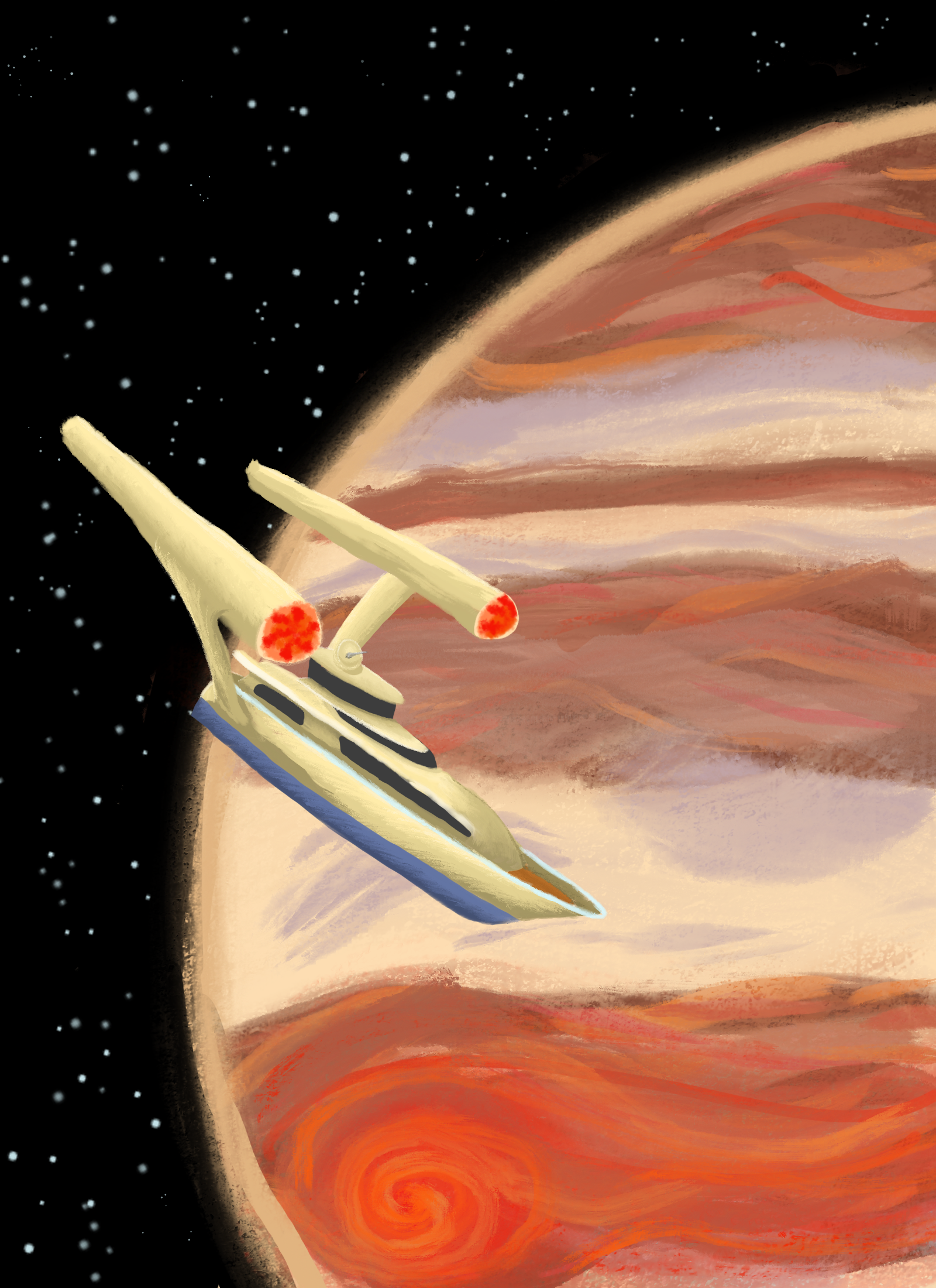 [Shown here: A painterly-style image of a space yacht in orbit around Jupiter. The yacht resembles an ocean-going vessel with Star Trek style warp nacelles, which are improperly placed]
I made the cover art for my All Hallows Read story, The World Will Not Miss...
There will be a promotional video, but I'm not doing any more work on this thing today.
Today, I chill.